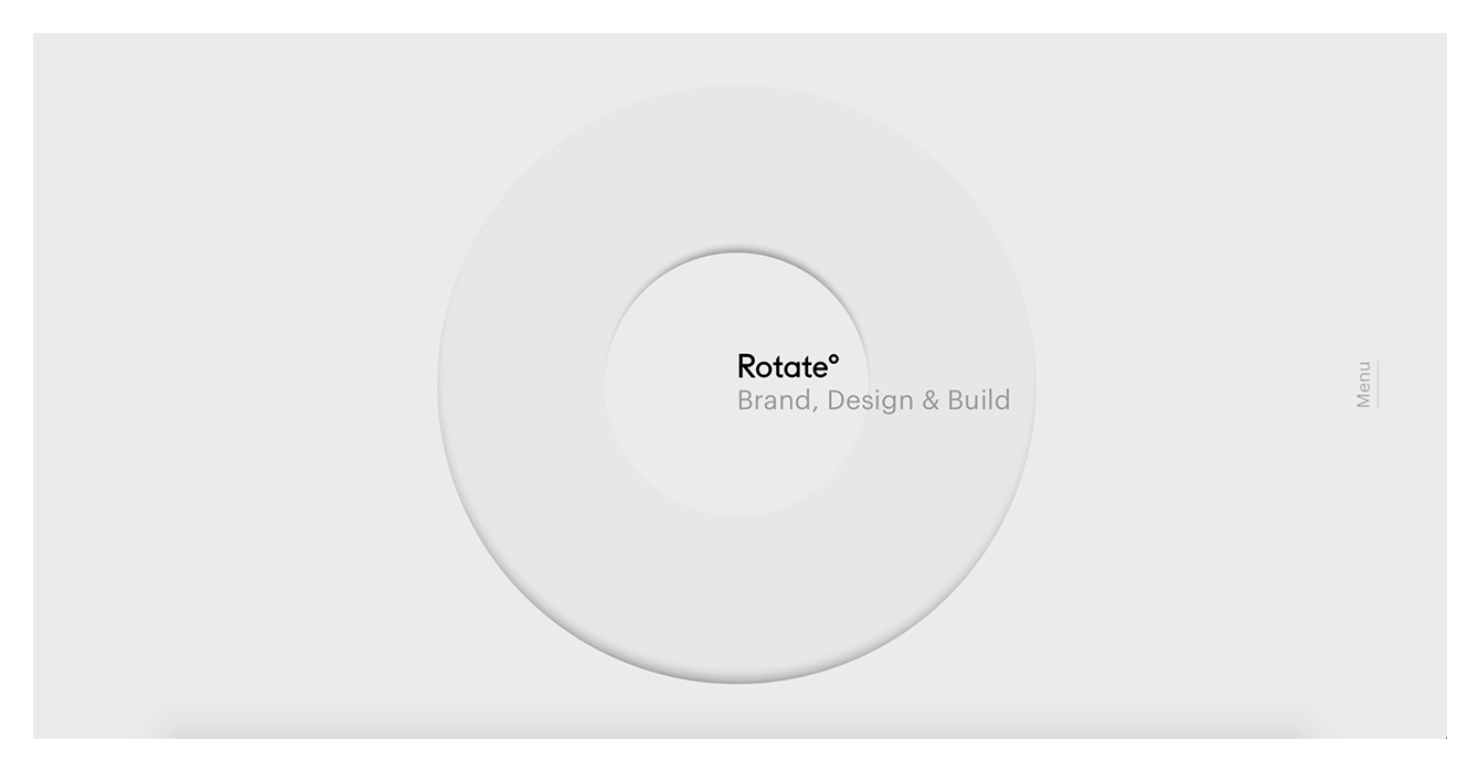
Google’s main page was the first cool minimalist webpage we have seen. And while the other trends come and go, this trend is here to stay forever!
The minimalist design is simple but not boring. In fact, the minimalist site may be one of the most beautiful and convenient. It is the best choice for portfolios, landing pages, blogs, business and e-commerce websites.
So, if you’re ready to make one for yourself – here’s your 10-tips guide to creating the perfect minimalist website design.

1. Keep it simple
The key to minimalist graphic design is simplicity. But simplicity is the thing that is not easy to create! It may take a lot of time to make your project look right.
The simplest modular grids are is the best ways to organize information on a site and emphasize the logical connections between blocks of content. To streamline the order of website elements and keep the design simple, start with choosing fonts and palette. Choose a key element of your design and make users notice it.
Create descriptions and messages to match the visual theme and the whole message of the website.
2. Be selective with the typography
The font can both help emphasize the minimalism of your site and reduce all efforts to nothing. The most effective website design uses clean, easy-to-read typography.
Design a font palette with one or two types of families and create a hierarchy of font elements. Highlight keywords, phrases, or messaging using a different color.
Remember that if you doubt that the font is good, change it. Typography is a key element of minimalistic graphic design and should be treated with great care.
3. Optimize your color palette
The color palette should be as simple as it can be. White sites are popular mainstream, black websites are a more exclusive solution.
But, in addition to black and white (or basic neutral), select one color to “wind up” the design. To maximize the effect of color in a minimalistic graphic design, use the shade consistently. But the main thing is not to be afraid to use it.
4. Create a consistent UX
The minimalist website design should not be just fairly simple and intuitive: it is also important to create a clear interface.
Using various UI elements and buttons for scrolling and interactions, create a consistent user interface that will not be complicated and does not require the user to think.
5. Get rid of everything you don’t need
Actually, this is the essence of minimalism. As soon as you get a diagram of your future design, think about each element and ask yourself: «Does it help the user?», «Does the website design benefit from it? Or is it just a decoration option?»
6. Feel free to use negative space
Negative space is one of the key elements in a minimalistic design formula. Every piece of minimalistic graphic design should make sense. To make this concept clear, leave enough space around each element.
For example, line spacing emphasizes their importance and improves readability. Negative space draws attention and helps to balance some heavy design elements. But don’t get stuck on symmetry, alignment, and such things. Make space a part of your design.
There are various ways to do that:
- unusual vertical navigation;
- images line up slightly outside the center of the page to create spaces that draw the visitor’s attention to different elements;
- small design elements are also placed vertically on the edges of the screen, changing the feels from scrolling.
7. Find balance and harmony
To create harmony, each heavy element in a design should have something that balances it: it can be space or some lighter elements.
Many minimalist designs are overloaded with text. Therefore, you should create a counterweight – then, your design will not seem bulky and one-sided.
8. Opt for a flat texture
Minimalism often resorts to flat textures, icons, and graphic elements. Flat interfaces do not use obvious lighting effects, shadows, gradients, or other types of textures that could make elements look glossy or 3D.
9. Use colorful images
Images are the most visible art form used in minimalist design. They provide emotional connections and create a special atmosphere. But photography or illustration must follow the principles of minimalism.
An incorrect image (a photograph with many details or distracting elements) will destroy the advantages of the minimalistic website interface and the integrity of the structure.
Creating a minimalistic image devoid of distracting detail or gaudy backdrop takes time and mastery. But you can cut corners if you make an image background transparent. And that is not some novelty – you see pictures with transparent backgrounds everywhere on websites, in the form of icons, sprites, and promotional images.
10. Add contrast
Since the goal of minimal design is ease of use and efficiency, it is best to use high-contrast text and graphic elements. This will draw attention to important elements and make the text more readable.
You don’t know where to create a simple landing page? Check out this tutorial about how to create a landing page on WordPress and enjoy your work.

Leave a Reply